7.2 ggplot2
Most of the plots that we have generated in this workshop have been using built-in R plotting functions. These are generally adequate, but for the highest quality charts we may choose to use a specialist package such as ggplot2. This is an extremely powerful and adaptable graphics package, but at the expense of being more challenging to learn and use than the standard tools.
Today we will just explore ggplot2 briefly to draw some better line graphs than earlier, but there are plenty of books and web resources to help you learn more, http://docs.ggplot2.org/current/ is a good place to start.
One of the first challenges of ggplot is that it doesn’t take data in the wide format of the matrices and data.frames we have been using up to now, that is, where a row contains measurements from multiple samples, or multiple measurements from one sample. Instead, data has to be reformatted into the long format, with just one measurement per row (along with sample identifiers, categorical variables and so on). To get our data into the right format, we will use the tidyr package.
head(iris)## Sepal.Length Sepal.Width Petal.Length Petal.Width Species
## 1 5.1 3.5 1.4 0.2 setosa
## 2 4.9 3.0 1.4 0.2 setosa
## 3 4.7 3.2 1.3 0.2 setosa
## 4 4.6 3.1 1.5 0.2 setosa
## 5 5.0 3.6 1.4 0.2 setosa
## 6 5.4 3.9 1.7 0.4 setosastr(iris)## 'data.frame': 150 obs. of 5 variables:
## $ Sepal.Length: num 5.1 4.9 4.7 4.6 5 5.4 4.6 5 4.4 4.9 ...
## $ Sepal.Width : num 3.5 3 3.2 3.1 3.6 3.9 3.4 3.4 2.9 3.1 ...
## $ Petal.Length: num 1.4 1.4 1.3 1.5 1.4 1.7 1.4 1.5 1.4 1.5 ...
## $ Petal.Width : num 0.2 0.2 0.2 0.2 0.2 0.4 0.3 0.2 0.2 0.1 ...
## $ Species : Factor w/ 3 levels "setosa","versicolor",..: 1 1 1 1 1 1 1 1 1 1 ...boxplot(iris[,1:4], main="Disrbution of Iris properties")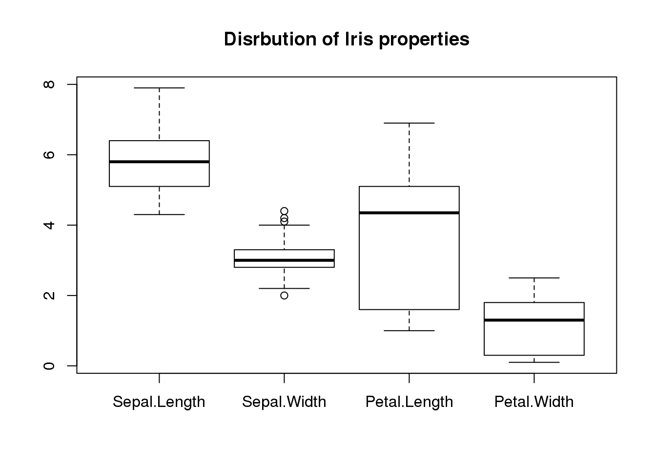
plot(iris$Sepal.Length, iris$Sepal.Width, pch=16, col=iris$Species,
     main="Sepal length vs width",
     xlab="Sepal Length",
     ylab="Sepal Width")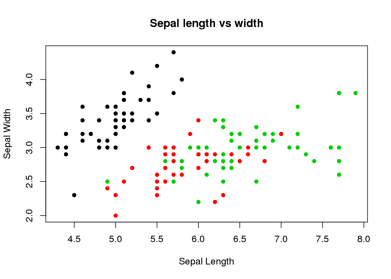
library(tidyr)
long.form <- gather(iris,feature,value,-Species)
head(long.form)
## Species feature value
## 1 setosa Sepal.Length 5.1
## 2 setosa Sepal.Length 4.9
## 3 setosa Sepal.Length 4.7
## 4 setosa Sepal.Length 4.6
## 5 setosa Sepal.Length 5.0
## 6 setosa Sepal.Length 5.4ggplot(long.form) + geom_boxplot(aes(x=feature,y=value))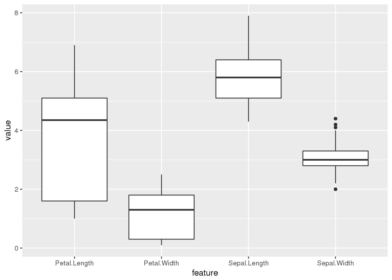
ggplot(long.form) + geom_violin(aes(x=feature,y=value))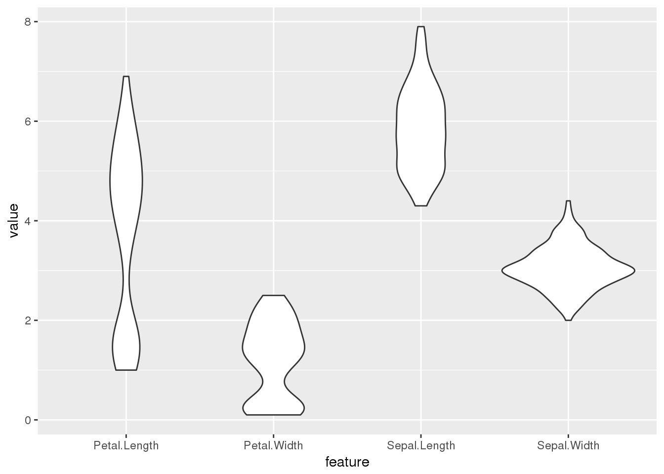
ggplot(long.form) + geom_boxplot(aes(x=feature,y=value,col=Species))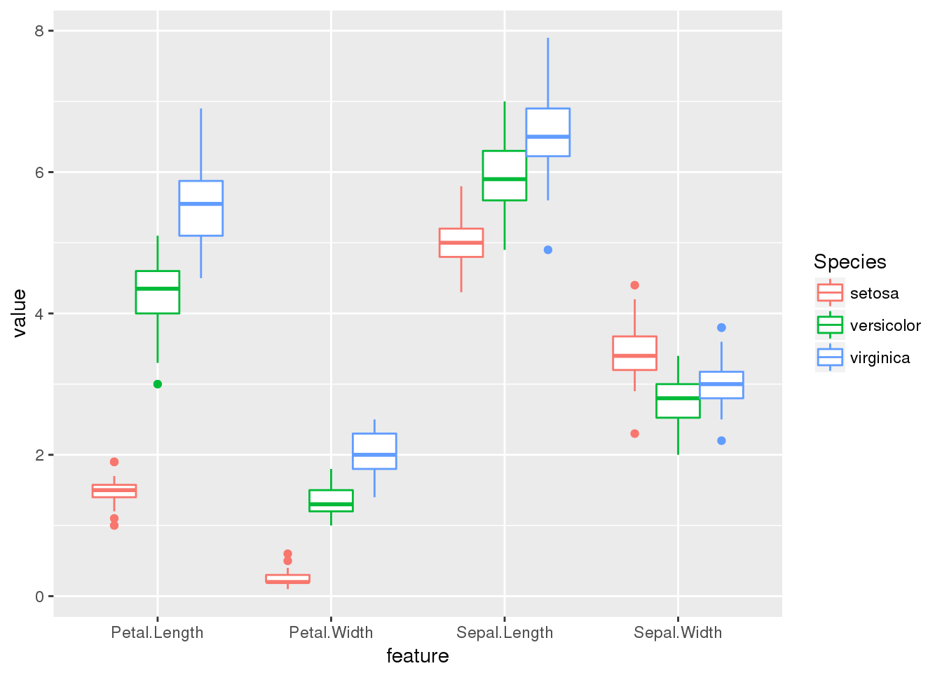
ggplot(long.form) + geom_boxplot(aes(x=feature,y=value,col=Species)) + facet_grid(.~Species) +
  theme_bw() + theme(axis.text.x = element_text(angle=90,hjust=1,vjust=0))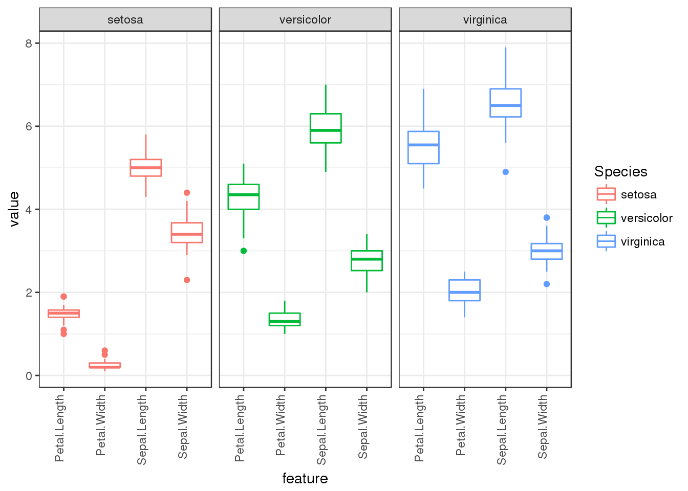
Challenge exercise Reformat our beaver.temp dataset into the long format and use ggplot() to plot the change in temperature for the two beavers over time.
Try to reproduce the following plot:
## Warning: Removed 15 rows containing missing values (geom_path).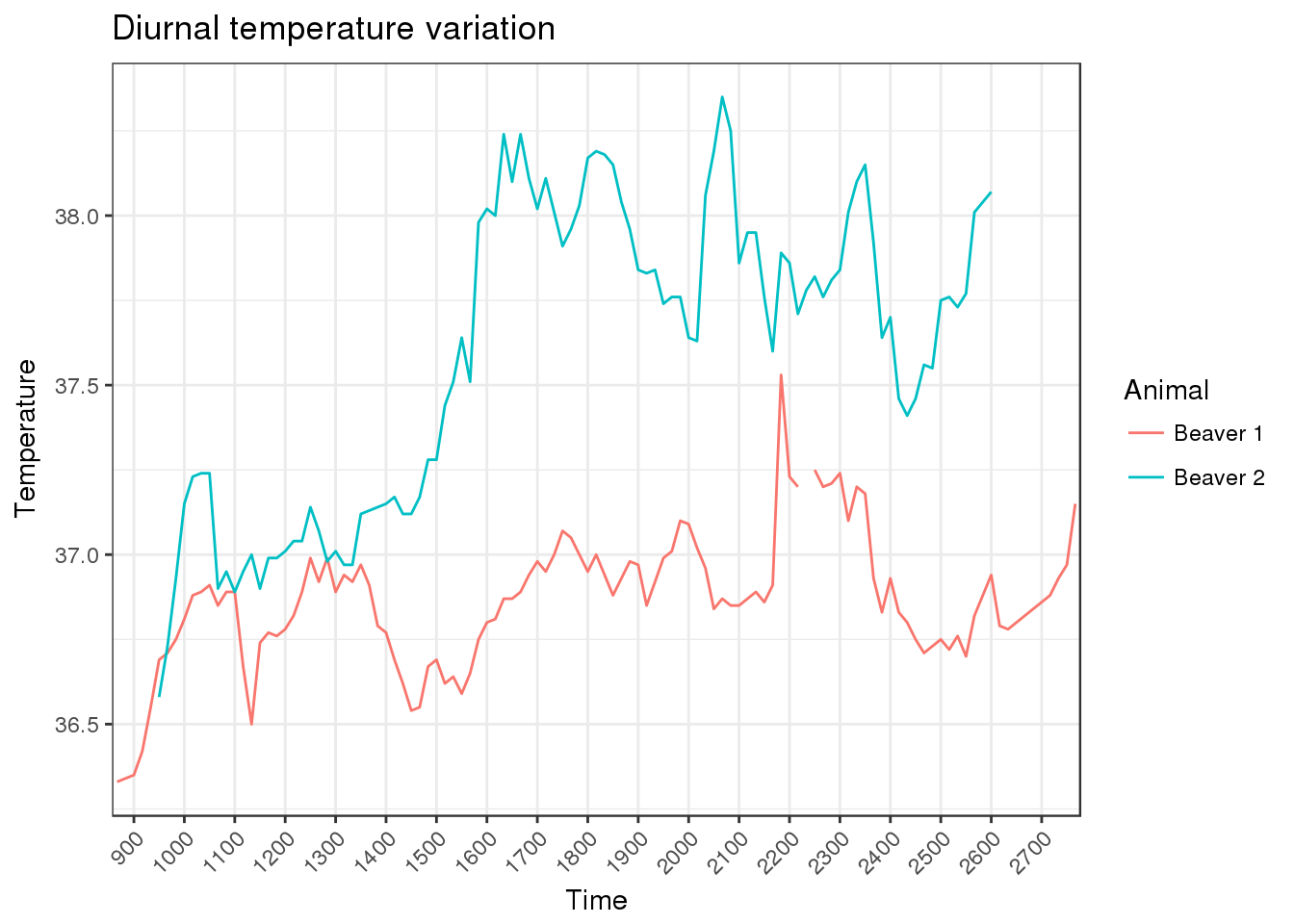
(Optional) Use the in-built diamonds dataset and plot some graphs using ggplot. e.g. are there any difference in the quantitative attributes: carat, depth, price, versus the categorical propreties: cut, color, clarity.