2.8 Using visualisation to verify (sanity checks)
2.8.1 Principal Component Analysis (PCA)
A Principal Component Analysis (PCA) can also be performed with these data using the mixOmics package . The proportion of explained variance histogram will show how much of the variability in the data is explained by each components.
Reads counts need to be transposed before being analysed with the mixomics functions, i.e. genes should be in columns and samples should be in rows. This is the code for transposing and checking the data before further steps:
library(mixOmics)

norm.expr.df <- t(norm.expr)
dim(norm.expr.df)
## [1] 8 15050## check if any feature has 0 variance, if so might need to remove
colVar <- apply(norm.expr.df,2,var)
length(which(colVar==0))## [1] 0The proportion of explained variance helps you determine how many components can explain the variability in your dataset and thus how many dimensions you should be looking at.
tuning <- tune.pca(norm.expr.df, center=TRUE, scale=TRUE)## Eigenvalues for the first 8 principal components, see object$sdev^2:
## PC1 PC2 PC3 PC4 PC5
## 9.478900e+03 4.280479e+03 5.932513e+02 1.994188e+02 1.850595e+02
## PC6 PC7 PC8
## 1.763042e+02 1.365877e+02 4.915698e-26
##
## Proportion of explained variance for the first 8 principal components, see object$explained_variance:
## PC1 PC2 PC3 PC4 PC5
## 6.298272e-01 2.844172e-01 3.941869e-02 1.325042e-02 1.229631e-02
## PC6 PC7 PC8
## 1.171456e-02 9.075594e-03 3.266245e-30
##
## Cumulative proportion explained variance for the first 8 principal components, see object$cum.var:
## PC1 PC2 PC3 PC4 PC5 PC6 PC7
## 0.6298272 0.9142444 0.9536631 0.9669135 0.9792098 0.9909244 1.0000000
## PC8
## 1.0000000
##
## Other available components:
## --------------------
## loading vectors: see object$rotation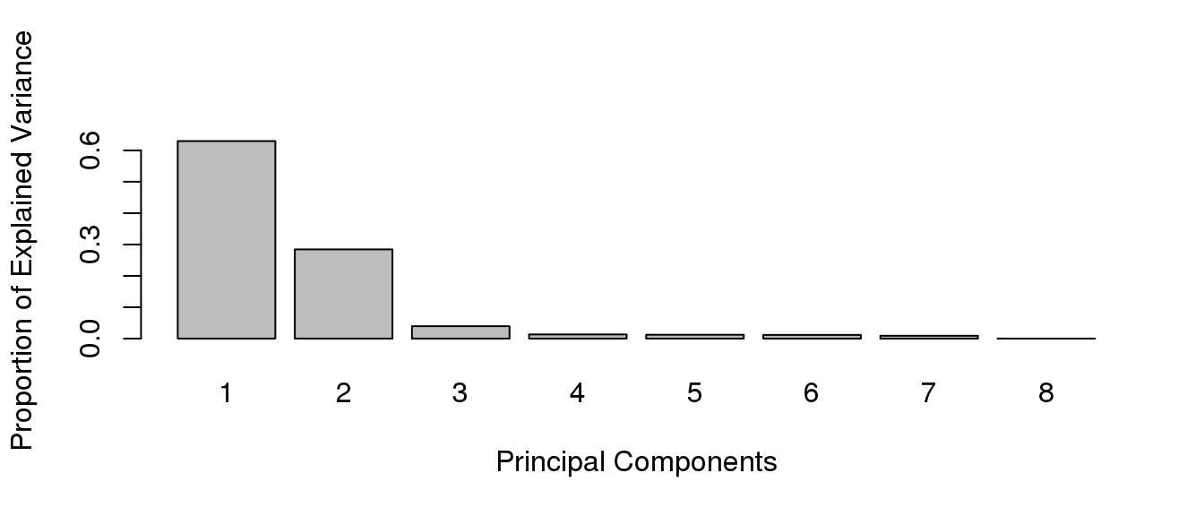
The variable tune$prop.var indicates the proportion of explained variance for the first 10 principal components:
Plotting this variable makes it easier to visualise and will allow future reference.
In most cases, the first 2 or 3 components explain more than half the variability in the dataset and can be used for plotting. The pca function will perform a principal components analysis on the given data matrix. The plotIndiv function will provide scatter plots for sample representation.
pca.result <- pca(norm.expr.df, ncomp=3, center=T, scale=T)
plotIndiv(pca.result, comp=c(1,2))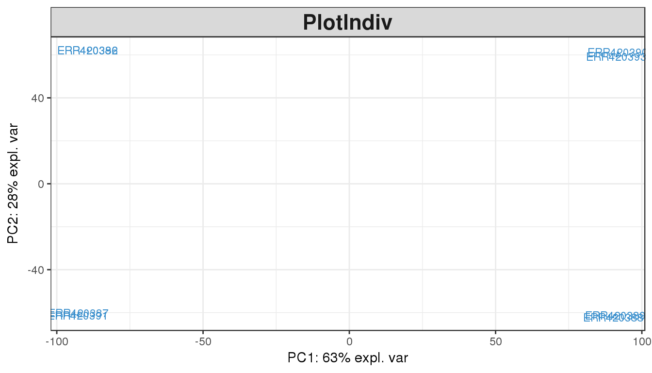
plotIndiv(pca.result, comp=c(1,2), group=group, cex=4, xlim=c(-110,110))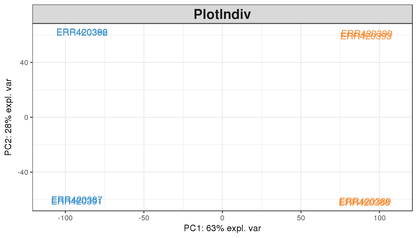
Once we colour by the tissue types, there is obviously a difference between the two groups. This is clearly visible by the gap on the x-axis (principal component 1), which explains 63% of the variability observed in the data.
Challenge
There is also a vertical gap (principal component 2) separating the 2 samples in each tissue type. Can you explain what this separation is? (hint: look at the experiment design expr.design).
Solution
Colour the PCA plot by group=expr.design\(technical.replicate.group</code>.</p> <p><strong>Food for thought</strong>: also colour the plot using <code>group=expr.design\)age, how does this compare when you coloured using the tissue type? They look the same, so we cannot confirm if the horizontal separation is in fact due to tissue type or due to the age. This is why experimental design and replicates are extremely important when performing an experiment.
The PCA plot of the first two components show a clear separation of the Brain and Liver samples across the 1st dimension. Within each sample group we can also notice a split between the 4 samples of each group, which seem to cluster in pair. This observation can be explained by another factor of variability in the data, commonly batch effect or another biological bias such as age or sex.
For the 30 most highly expressed genes, we want to identify the reason for the split between samples from the same tissues. To do this, break the problem down:
- Get the read counts for the 30 most highly expressed genes
- Transpose this matrix of read counts
- Check the number of dimensions explaining the variability in the dataset
- Run the PCA with an appropriate number of components
-
Annotate the samples with their age
- re-run PCA
- plot the main components
-
Annotate the samples with other clinical data
- re-run the PCA
- plot the main components until you can separate the samples within each tissue group