2.10 Verification using visualisation
Plot the top 6 DEGs to verify that they are indeed different between the groups \(brain vs liver\).
The tidyr library helps us reshape the data from the wide form into a long form, which is much more flexible to work with when using ggplot for plotting graphs.
library(tidyr)##
## Attaching package: 'tidyr'## The following object is masked from 'package:S4Vectors':
##
## expandtopDEG <- rownames(limma.sigFC.DEG)[1:6]
topDEG.norm <- as.data.frame(norm.expr[which(rownames(norm.expr) %in% topDEG),])
topDEG.norm$geneID <- rownames(topDEG.norm)
topDEG.norm.long <- gather(topDEG.norm, key=sample, value=value, -geneID)
topDEG.norm.long$group <- expr.design[topDEG.norm.long$sample,'tissue']
ggplot(topDEG.norm.long) + geom_point(aes(group,value,col=group),size=2,pch=1) +
theme_bw() + facet_wrap(~geneID)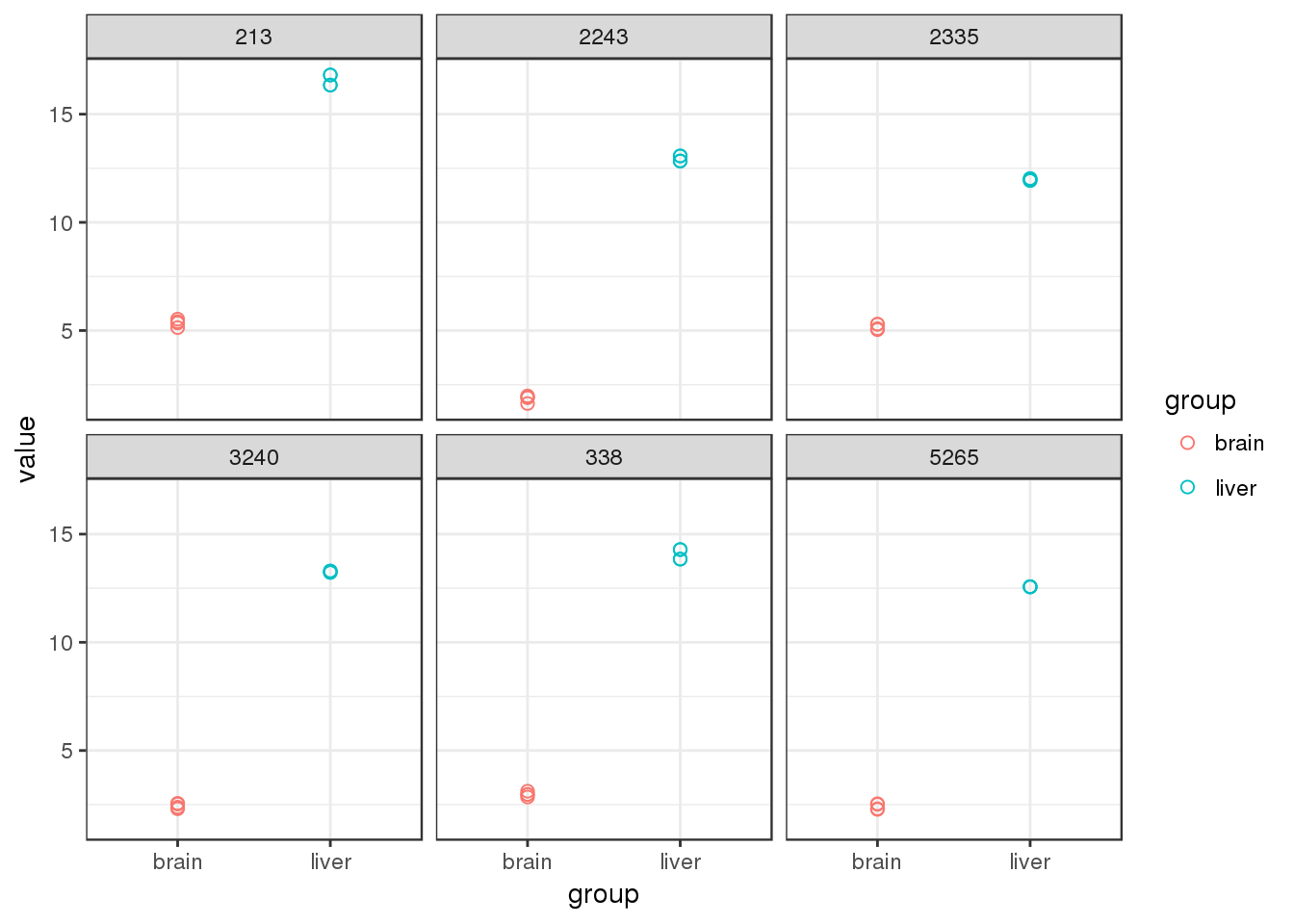
2.10.1 Hierachical clustering
In order to investigate the relationship between samples, hierarchical clustering can be performed using the heatmap function. In this example, heatmap calculates a matrix of euclidean distances from the normalised expression for the 100 most signficant DE genes.
topDEG <- rownames(limma.sigFC.DEG)[1:100]
highNormGenes <- norm.expr[topDEG,]
dim(highNormGenes)
## [1] 100 8par(cex.main=1)
heatmap(highNormGenes, col=topo.colors(50), cexCol=1,
main='Top 100 DEG')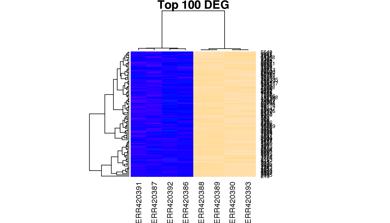
You will notice that the samples clustering does not follow the original order in the data matrix (alphabetical order “ERR420386” to “ERR420393”). They have been re-ordered according to the similarity of the 100 genes expression profiles. To understand what biological effect lies under this clustering, one can use the samples annotation for labeling (samples group, age, sex etc).
par(cex.main=1)
heatmap(highNormGenes, col=topo.colors(50),cexCol=1,
        main='Top 100 DEG', labCol = group)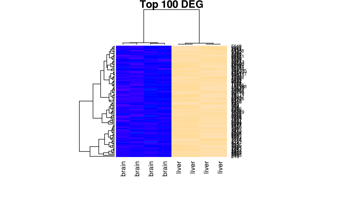
Produce a heatmap for the bottom 100 significant genes.
- How many “groups” do you see?
- Can you explain them with the experimental design?
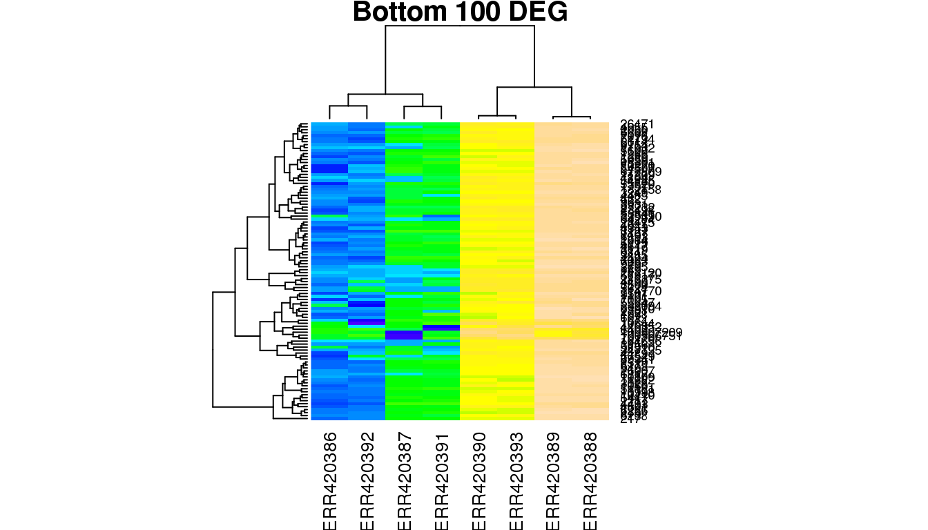
Challenge
-
Just to be extra sure and for our own confidence, randomly select another 100 genes that are not in the DEG list and repeat the hierachical clustering using the
heatmapplot. -
Out of these 100, pick 6 to plot the gene wise differences as seen previously.
Solution