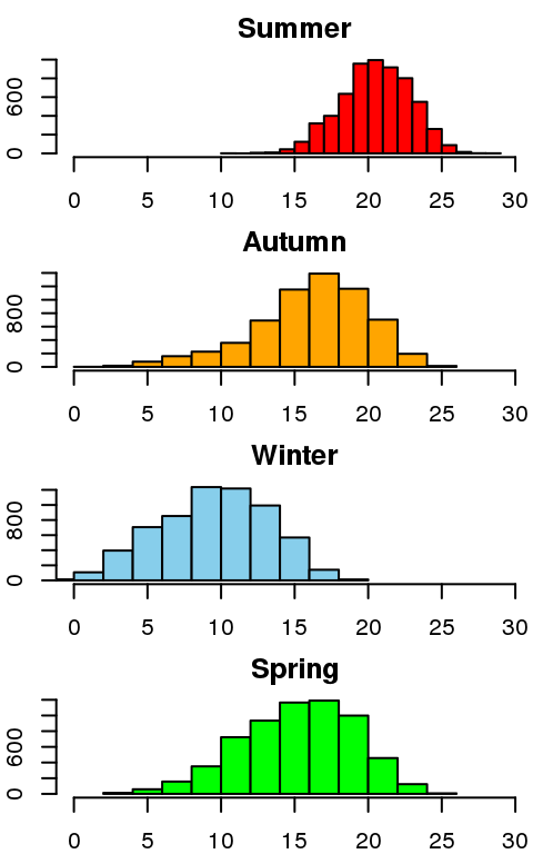
7.2 Histograms
A histogram shows the distribution of data for typically a single vector. This time we will plot the distribution for each season, again using the for loop to generate the plots. Note how we also keep the x-axis scale the same across the plots, this time using the xlim parameter.
par(mfrow=c(4,1),mar=c(2,2,2,0))
for(season in levels(seasons)) {
  keep.rows <- seasons == season
  temp <- as.matrix(minTemp[keep.rows,])
  hist(temp, main=season, col=season.col[[season]], xlim=c(0,30))
}
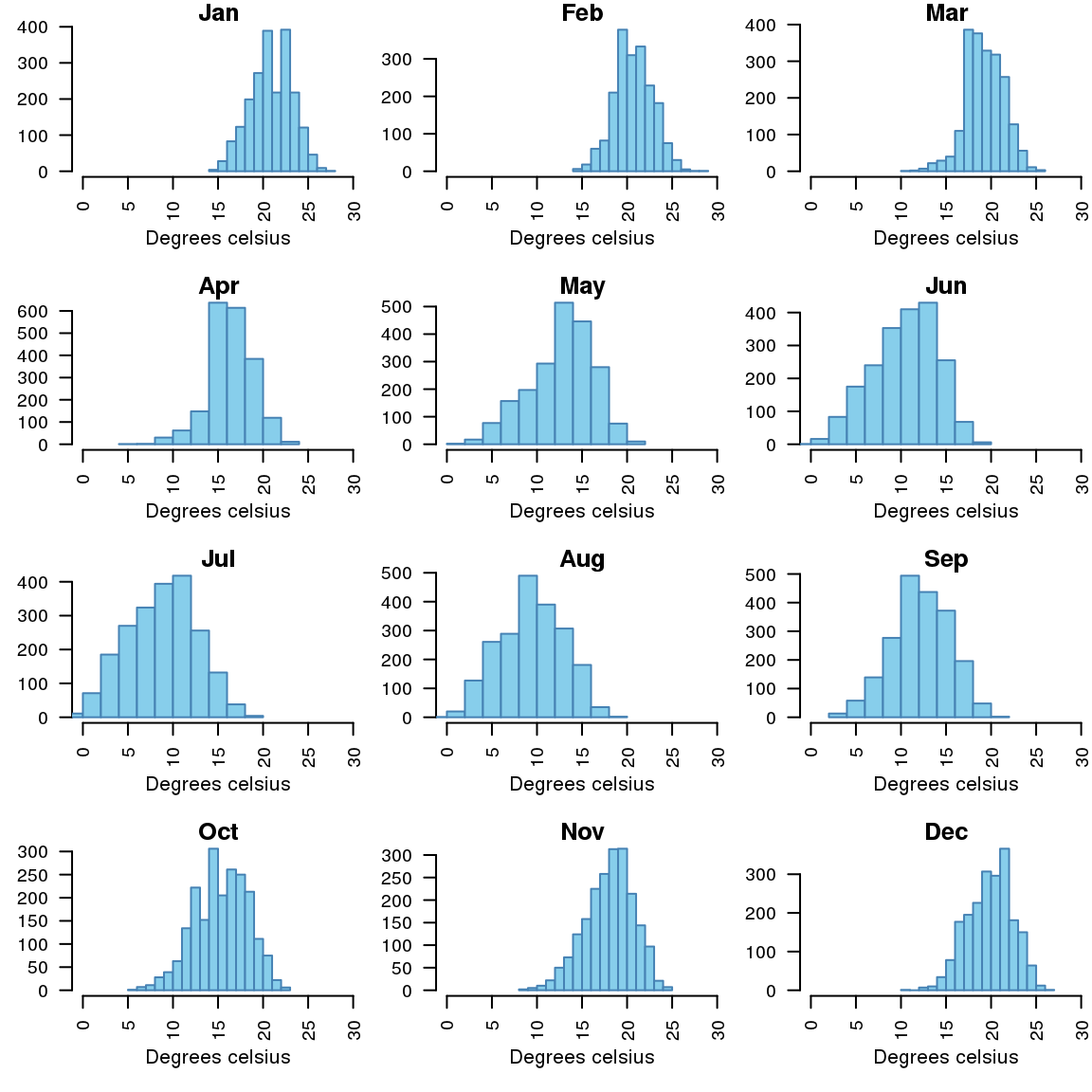
Try creating a histogram for temperatures by month.
Expected output