7.4 Scatterplots
Scatterplots are widely used for plotting data where an object has mutiple variables. This is a quick way to look for any correlation in the dataset.
plot(minTemp$X1996, minTemp$X2016, cex=0.5,
     main='1996 vs 2016', xlab='1996',ylab='2016')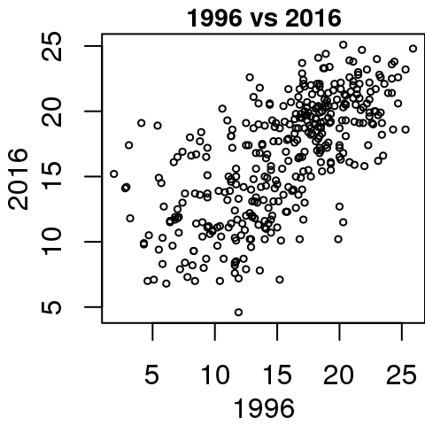
plot(minTemp$X1996, minTemp$X2016, cex=0.5,
col=as.character(season.col[seasons]),
main='1996 vs 2016', xlab='1996',ylab='2016')
legend('bottomright', bty='n', legend=levels(seasons),
lty=1, cex=0.75, col=as.character(season.col))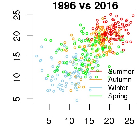 The
The pch parameter is the symbols to use, search in help for pch to get a list of allowable symbols
7.4.1 Scatterplot matrix
You can also generate a scatter plot matrix using the following code. This will make a \(N \times N\) plot of all the columns in your dataset. Again this is only useful for numeric columns.
plot(minTemp[,c(1:2,61:62)],
     col=as.character(season.col[seasons]),
     cex=0.5, xlim=c(0,30), ylim=c(0,30))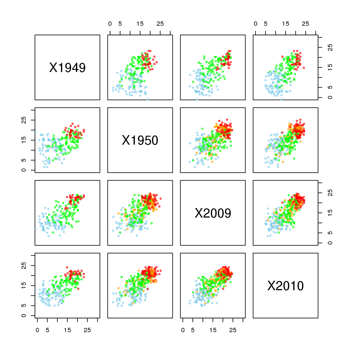
Becareful of generating scatterplot matrix if you have a BIG dataset, as this can take up all your computer memory.